Class imbalance is a common challenge in real-world machine learning applications. It occurs when the classes within a dataset are not represented equally. For instance, in credit card fraud detection, normal transactions might comprise 99.9% of the dataset, while fraudulent transactions make up only 0.1%. Similar skews appear in medical diagnosis, anomaly detection, and industrial fault assessment.
When machine learning models are trained on highly imbalanced data, they tend to optimize for the majority class. This yields models that perform exceptionally well on paper but fail completely at identifying the critical minority class.
This article provides a practical guide to understanding, evaluating, and mitigating class imbalance with visual examples you can run end to end.
The Core Problem and Mathematical Intuition
To understand why class imbalance breaks standard classification workflows, we must analyze how basic optimization and evaluation metrics behave when data distributions are heavily skewed.
The Accuracy Paradox
Classification models are frequently evaluated using classification accuracy. Accuracy is defined as the ratio of correctly predicted observations to the total number of observations. Mathematically, it is expressed as:
$$\text{Accuracy} = \frac{TP + TN}{TP + TN + FP + FN}$$Throughout this article we treat Class 1 (minority) as the positive class. With that convention:
\(TP\) = True Positives (minority class correctly predicted)
\(TN\) = True Negatives (majority class correctly predicted)
\(FP\) = False Positives (majority class incorrectly predicted as minority)
\(FN\) = False Negatives (minority class incorrectly predicted as majority)
Consider a dataset with 10,000 samples where 9,900 belong to Class 0 (majority) and 100 belong to Class 1 (minority). If a naive classifier always predicts Class 0 regardless of the input features, its performance metrics are:
\(TN = 9{,}900\), \(FN = 100\), \(TP = 0\), \(FP = 0\)
Plugging these values into our accuracy formula:
$$\text{Accuracy} = \frac{0 + 9{,}900}{0 + 9{,}900 + 0 + 100} = \frac{9{,}900}{10{,}000} = 99\%$$An accuracy of 99% implies an excellent model. However, the model has a True Positive Rate (Recall) of exactly 0%, making it entirely useless for detecting the minority class. This phenomenon is known as the Accuracy Paradox.
Evaluation Metrics for Imbalanced Datasets
Because accuracy fails to reflect model utility in imbalanced contexts, alternate metrics derived from the confusion matrix must be used.
Precision, Recall, and the \(F_1\)-Score
Instead of checking overall correctness, we isolate performance regarding the minority positive class using individual components:
- Precision: Out of all samples flagged as positive, how many were actually positive?
- Recall (Sensitivity): Out of all actual positive samples, how many did the model capture?
There is an inherent trade-off between Precision and Recall. Lowering the classification threshold increases Recall but reduces Precision because more majority samples are incorrectly classified as positive. Raising the threshold increases Precision but reduces Recall.
To combine these into a single metric, we use the \(F_1\)-Score, which is the harmonic mean of Precision and Recall:
$$F_1 = 2 \cdot \frac{\text{Precision} \cdot \text{Recall}}{\text{Precision} + \text{Recall}}$$The harmonic mean penalizes extreme imbalances between the two components. If either Precision or Recall drops to 0, the \(F_1\)-score drops to 0.
ROC-AUC vs. Precision-Recall AUC
Two area-under-the-curve metrics are widely used to assess models across all possible probability thresholds:
- Receiver Operating Characteristic (ROC) Curve: plots the True Positive Rate (\(TPR\)) against the False Positive Rate (\(FPR\)).
- Precision-Recall (PR) Curve: plots Precision against Recall.
While ROC-AUC is standard for balanced datasets, it can provide an overly optimistic assessment on highly imbalanced data because \(FPR\) includes True Negatives (\(TN\)) in its denominator. When the majority class is massive, \(TN\) is large, which keeps \(FPR\) artificially low even if the model commits many absolute false positive errors.
The Precision-Recall curve does not include \(TN\). Therefore, PR-AUC (Average Precision) is often more informative when the minority class is small.
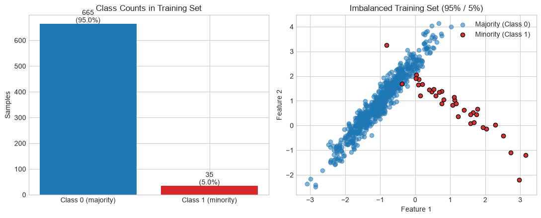
Build a Small Imbalanced Dataset
We use a synthetic 2D dataset so every technique below can be visualized. The same train/test split is reused throughout the notebook.
import numpy as np
import matplotlib.pyplot as plt
from collections import Counter

from sklearn.datasets import make_classification
from sklearn.model_selection import train_test_split
from sklearn.linear_model import LogisticRegression
from sklearn.metrics import (
    accuracy_score, precision_score, recall_score, f1_score,
    confusion_matrix, ConfusionMatrixDisplay,
    roc_curve, auc, precision_recall_curve, average_precision_score,
)

try:
    plt.style.use('seaborn-v0_8-whitegrid')
except OSError:
    plt.style.use('ggplot')

X, y = make_classification(
    n_samples=1000,
    n_features=2,
    n_informative=2,
    n_redundant=0,
    n_clusters_per_class=1,
    weights=[0.95, 0.05],
    flip_y=0,
    random_state=42,
)
X_train, X_test, y_train, y_test = train_test_split(
    X, y, test_size=0.3, stratify=y, random_state=42
)

print('Train distribution:', Counter(y_train))
print('Test distribution :', Counter(y_test))

fig, (ax0, ax) = plt.subplots(1, 2, figsize=(11, 4.5))
counts = [Counter(y_train)[0], Counter(y_train)[1]]
ax0.bar(['Class 0 (majority)', 'Class 1 (minority)'], counts, color=['#1f77b4', '#d62728'])
ax0.set_title('Class Counts in Training Set')
ax0.set_ylabel('Samples')
for i, c in enumerate(counts):
    ax0.text(i, c + 5, f'{c}\n({100 * c / sum(counts):.1f}%)', ha='center')

ax.scatter(X_train[y_train == 0, 0], X_train[y_train == 0, 1],
           label='Majority (Class 0)', alpha=0.55, c='#1f77b4')
ax.scatter(X_train[y_train == 1, 0], X_train[y_train == 1, 1],
           label='Minority (Class 1)', alpha=0.95, c='#d62728', edgecolors='k')
ax.set_title('Imbalanced Training Set (95% / 5%)')
ax.set_xlabel('Feature 1')
ax.set_ylabel('Feature 2')
ax.legend()
plt.tight_layout()
plt.show()
Train distribution: Counter({np.int64(0): 665, np.int64(1): 35})
Test distribution : Counter({np.int64(0): 285, np.int64(1): 15})
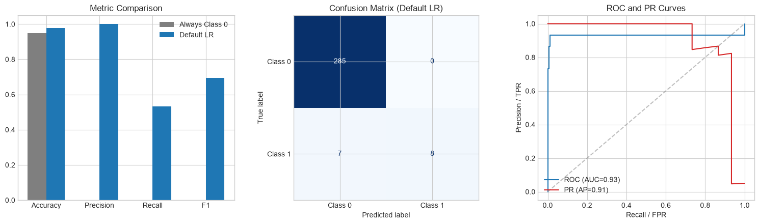
Visualize Why Accuracy Misleads
We compare a useless majority-only classifier against a standard logistic regression model on the same test set.
def evaluate_model(name, y_true, y_pred, y_prob=None):
    metrics = {
        'Accuracy': accuracy_score(y_true, y_pred),
        'Precision': precision_score(y_true, y_pred, zero_division=0),
        'Recall': recall_score(y_true, y_pred, zero_division=0),
        'F1': f1_score(y_true, y_pred, zero_division=0),
    }
    if y_prob is not None:
        fpr, tpr, _ = roc_curve(y_true, y_prob)
        metrics['ROC-AUC'] = auc(fpr, tpr)
        metrics['PR-AUC'] = average_precision_score(y_true, y_prob)
    print(f'\n{name}')
    for k, v in metrics.items():
        print(f'  {k:10s}: {v:.3f}')
    return metrics

y_pred_majority = np.zeros_like(y_test)
metrics_majority = evaluate_model('Always predict Class 0', y_test, y_pred_majority)

baseline = LogisticRegression(random_state=42)
baseline.fit(X_train, y_train)
y_prob_baseline = baseline.predict_proba(X_test)[:, 1]
y_pred_baseline = baseline.predict(X_test)
metrics_baseline = evaluate_model(
    'Logistic Regression (default)', y_test, y_pred_baseline, y_prob_baseline
)

fig, axes = plt.subplots(1, 3, figsize=(15, 4.5))

names = ['Accuracy', 'Precision', 'Recall', 'F1']
majority_vals = [metrics_majority[k] for k in names]
baseline_vals = [metrics_baseline[k] for k in names]
x = np.arange(len(names))
width = 0.35
axes[0].bar(x - width / 2, majority_vals, width, label='Always Class 0', color='#7f7f7f')
axes[0].bar(x + width / 2, baseline_vals, width, label='Default LR', color='#1f77b4')
axes[0].set_xticks(x, names)
axes[0].set_ylim(0, 1.05)
axes[0].set_title('Metric Comparison')
axes[0].legend()

ConfusionMatrixDisplay(
    confusion_matrix(y_test, y_pred_baseline),
    display_labels=['Class 0', 'Class 1'],
).plot(ax=axes[1], cmap='Blues', colorbar=False)
axes[1].set_title('Confusion Matrix (Default LR)')

fpr, tpr, _ = roc_curve(y_test, y_prob_baseline)
prec, rec, _ = precision_recall_curve(y_test, y_prob_baseline)
axes[2].plot(fpr, tpr, label=f'ROC (AUC={auc(fpr, tpr):.2f})', color='#1f77b4')
axes[2].plot(
    rec, prec,
    label=f'PR (AP={average_precision_score(y_test, y_prob_baseline):.2f})',
    color='#d62728',
)
axes[2].plot([0, 1], [0, 1], '--', color='gray', alpha=0.5)
axes[2].set_xlabel('Recall / FPR')
axes[2].set_ylabel('Precision / TPR')
axes[2].set_title('ROC and PR Curves')
axes[2].legend(loc='lower left')

plt.tight_layout()
plt.show()
Always predict Class 0
  Accuracy  : 0.950
  Precision : 0.000
  Recall    : 0.000
  F1        : 0.000

Logistic Regression (default)
  Accuracy  : 0.977
  Precision : 1.000
  Recall    : 0.533
  F1        : 0.696
  ROC-AUC   : 0.932
  PR-AUC    : 0.906
Data-Level Solutions: Resampling Techniques
Data-level methods alter the composition of the training dataset before feeding it into the machine learning algorithm. The objective is to construct a more balanced class distribution.
Naive Techniques and Their Structural Risks
- Random Undersampling: Randomly removes instances from the majority class until the classes are equal.
- Risk: Discards large amounts of information, which can prevent the model from learning the true boundaries of the majority class.
- Random Oversampling: Randomly duplicates existing instances of the minority class.
- Risk: Because it exactly replicates minority points, it forces the model to learn highly specific rules around those exact coordinates, resulting in severe overfitting.
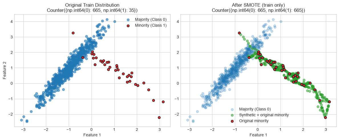
Synthetic Minority Over-sampling Technique (SMOTE)
To avoid basic duplication, SMOTE creates entirely new synthetic data points along the line segments joining existing minority class samples. For every minority class sample \(\mathbf{x}_i\), the algorithm computes its \(k\)-nearest neighbors within the minority class. One of these neighbors, \(\mathbf{x}_{nn}\), is randomly selected. A new synthetic sample is generated as:
$$\mathbf{x}_{new} = \mathbf{x}_i + \lambda (\mathbf{x}_{nn} - \mathbf{x}_i)$$Where:
- \(\mathbf{x}_i\) is the target minority vector
- \(\mathbf{x}_{nn}\) is the selected neighbor vector
- \(\lambda \sim U(0, 1)\) is a random interpolation weight
This encourages the model to learn the broader geometric space occupied by the minority class rather than memorizing specific points.
The Data Leakage Trap
A critical error when using resampling methods like SMOTE is applying them to the entire dataset before splitting it into training and testing partitions.
If you apply SMOTE first and then run a train-test split, synthetic points derived from test observations can end up in the training set. That leaks information from the evaluation set into training and produces artificially inflated metrics.
Rule: Always split first (or use cross-validation). Only resample the training fold.
Visualize SMOTE on the Training Set
from imblearn.over_sampling import SMOTE

smote = SMOTE(random_state=42)
X_train_resampled, y_train_resampled = smote.fit_resample(X_train, y_train)

fig, (ax1, ax2) = plt.subplots(1, 2, figsize=(12, 5))

ax1.scatter(X_train[y_train == 0, 0], X_train[y_train == 0, 1],
            label='Majority (Class 0)', alpha=0.6, c='#1f77b4')
ax1.scatter(X_train[y_train == 1, 0], X_train[y_train == 1, 1],
            label='Minority (Class 1)', alpha=0.95, c='#d62728', edgecolors='k')
ax1.set_title(f'Original Train Distribution\n{Counter(y_train)}')
ax1.set_xlabel('Feature 1')
ax1.set_ylabel('Feature 2')
ax1.legend()

ax2.scatter(X_train_resampled[y_train_resampled == 0, 0],
            X_train_resampled[y_train_resampled == 0, 1],
            label='Majority (Class 0)', alpha=0.25, c='#1f77b4')
ax2.scatter(X_train_resampled[y_train_resampled == 1, 0],
            X_train_resampled[y_train_resampled == 1, 1],
            label='Synthetic + original minority', alpha=0.55, c='#2ca02c')
ax2.scatter(X_train[y_train == 1, 0], X_train[y_train == 1, 1],
            label='Original minority', alpha=0.95, c='#d62728', edgecolors='k')
ax2.set_title(f'After SMOTE (train only)\n{Counter(y_train_resampled)}')
ax2.set_xlabel('Feature 1')
ax2.legend()

plt.tight_layout()
plt.show()

model_smote = LogisticRegression(random_state=42)
model_smote.fit(X_train_resampled, y_train_resampled)
y_prob_smote = model_smote.predict_proba(X_test)[:, 1]
Algorithm-Level Solutions: Cost-Sensitive Learning
Algorithm-level methods change how the model learns without altering the underlying dataset. Tree-based ensembles (Random Forests, Gradient Boosting) are often more robust to imbalance than distance-based models because splits can isolate small minority regions in leaf nodes.
Modifying the Loss Function via Class Weights
Standard classification models assume all misclassification errors carry equal cost. Cost-sensitive learning assigns higher penalty to minority-class errors during optimization.
For binary cross-entropy across \(N\) samples, the standard objective is:
$$\mathcal{L} = - \frac{1}{N} \sum_{i=1}^{N} \left[ y_i \log(\hat{y}_i) + (1 - y_i) \log(1 - \hat{y}_i) \right]$$With class weights \(w_1\) and \(w_0\):
$$\mathcal{L}_{weighted} = - \frac{1}{N} \sum_{i=1}^{N} \left[ w_1 \cdot y_i \log(\hat{y}_i) + w_0 \cdot (1 - y_i) \log(1 - \hat{y}_i) \right]$$A common automatic choice is inverse class frequency:
$$w_j = \frac{N}{\text{Number of classes} \cdot N_j}$$where \(N_j\) is the number of samples in class \(j\). This increases the gradient contribution when the model misclassifies a minority point.
In scikit-learn you can pass class_weight='balanced'. In XGBoost, scale_pos_weight plays a similar role for the positive class.
from xgboost import XGBClassifier
ratio = float(Counter(y_train)[0]) / Counter(y_train)[1]
model_weighted = LogisticRegression(class_weight='balanced', random_state=42)
model_weighted.fit(X_train, y_train)
y_prob_weighted = model_weighted.predict_proba(X_test)[:, 1]
model_xgb = XGBClassifier(
scale_pos_weight=ratio,
random_state=42,
eval_metric='logloss',
)
model_xgb.fit(X_train, y_train)
y_prob_xgb = model_xgb.predict_proba(X_test)[:, 1]
metrics_weighted = evaluate_model(
'Logistic Regression (balanced weights)',
y_test,
model_weighted.predict(X_test),
y_prob_weighted,
)
metrics_xgb = evaluate_model(
'XGBoost (scale_pos_weight)',
y_test,
model_xgb.predict(X_test),
y_prob_xgb,
)
metrics_smote = evaluate_model(
'Logistic Regression + SMOTE',
y_test,
model_smote.predict(X_test),
y_prob_smote,
)
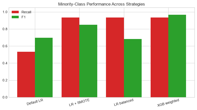
fig, ax = plt.subplots(figsize=(8, 4.5))
labels = ['Default LR', 'LR + SMOTE', 'LR balanced', 'XGB weighted']
all_metrics = [metrics_baseline, metrics_smote, metrics_weighted, metrics_xgb]
f1_vals = [m['F1'] for m in all_metrics]
recall_vals = [m['Recall'] for m in all_metrics]
x = np.arange(len(labels))
ax.bar(x - 0.2, recall_vals, 0.4, label='Recall', color='#d62728')
ax.bar(x + 0.2, f1_vals, 0.4, label='F1', color='#2ca02c')
ax.set_xticks(x, labels, rotation=15)
ax.set_ylim(0, 1.05)
ax.set_title('Minority-Class Performance Across Strategies')
ax.legend()
plt.tight_layout()
plt.show()
Logistic Regression (balanced weights)
  Accuracy  : 0.957
  Precision : 0.538
  Recall    : 0.933
  F1        : 0.683
  ROC-AUC   : 0.929
  PR-AUC    : 0.863

XGBoost (scale_pos_weight)
  Accuracy  : 0.997
  Precision : 1.000
  Recall    : 0.933
  F1        : 0.966
  ROC-AUC   : 0.994
  PR-AUC    : 0.958

Logistic Regression + SMOTE
  Accuracy  : 0.983
  Precision : 0.778
  Recall    : 0.933
  F1        : 0.848
  ROC-AUC   : 0.932
  PR-AUC    : 0.918
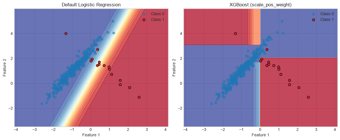
Visualize the Decision Boundary
A 2D probability surface makes it easier to see how cost-sensitive training shifts the boundary toward the minority cluster.
x_min, x_max = X[:, 0].min() - 1, X[:, 0].max() + 1
y_min, y_max = X[:, 1].min() - 1, X[:, 1].max() + 1
xx, yy = np.meshgrid(
    np.arange(x_min, x_max, 0.02),
    np.arange(y_min, y_max, 0.02),
)
grid = np.c_[xx.ravel(), yy.ravel()]

fig, axes = plt.subplots(1, 2, figsize=(12, 5))

for ax, model, title in [
    (axes[0], baseline, 'Default Logistic Regression'),
    (axes[1], model_xgb, 'XGBoost (scale_pos_weight)'),
]:
    Zp = model.predict_proba(grid)[:, 1].reshape(xx.shape)
    ax.contourf(xx, yy, Zp, levels=20, cmap='RdYlBu_r', alpha=0.75)
    ax.scatter(X_test[y_test == 0, 0], X_test[y_test == 0, 1],
               label='Class 0', alpha=0.55, c='#1f77b4')
    ax.scatter(X_test[y_test == 1, 0], X_test[y_test == 1, 1],
               label='Class 1', alpha=0.95, c='#d62728', edgecolors='k')
    ax.set_title(title)
    ax.set_xlabel('Feature 1')
    ax.set_ylabel('Feature 2')
    ax.legend()

plt.tight_layout()
plt.show()
Advanced Optimization Strategies
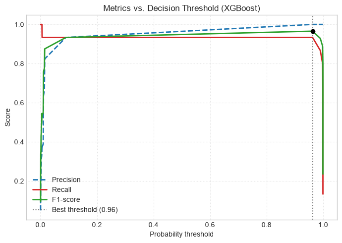
Decision Threshold Tuning
By default, classifiers convert probabilities to labels with a threshold of \(\tau = 0.5\). If \(P(y=1 \mid \mathbf{x}) \ge 0.5\), the prediction is Class 1.
On imbalanced data, minority-class probabilities may rarely exceed 0.5. Instead of retraining, you can shift the decision threshold after training to maximize \(F_1\) or target a precision/recall trade-off.
y_prob = model_xgb.predict_proba(X_test)[:, 1]
precisions, recalls, thresholds = precision_recall_curve(y_test, y_prob)

f1_scores = []
for t in thresholds:
    y_pred_t = (y_prob >= t).astype(int)
    f1_scores.append(f1_score(y_test, y_pred_t, zero_division=0))

best_idx = int(np.argmax(f1_scores))
best_threshold = thresholds[best_idx]
best_f1 = f1_scores[best_idx]

print(f'Optimal threshold: {best_threshold:.2f} (max F1 = {best_f1:.2f})')

fig, ax = plt.subplots(figsize=(7, 5))
ax.plot(thresholds, precisions[:-1], '--', color='#1f77b4', label='Precision', lw=2)
ax.plot(thresholds, recalls[:-1], '-', color='#d62728', label='Recall', lw=2)
ax.plot(thresholds, f1_scores, '-', color='#2ca02c', label='F1-score', lw=2)
ax.axvline(
    best_threshold,
    color='#7f7f7f',
    linestyle=':',
    label=f'Best threshold ({best_threshold:.2f})',
)
ax.scatter(best_threshold, best_f1, color='black', zorder=5)
ax.set_xlabel('Probability threshold')
ax.set_ylabel('Score')
ax.set_title('Metrics vs. Decision Threshold (XGBoost)')
ax.legend(loc='lower left')
ax.grid(True, linestyle=':', alpha=0.6)
plt.tight_layout()
plt.show()
Optimal threshold: 0.96 (max F1 = 0.97)
Anomaly Detection Alternatives
When imbalance is extreme (for example, well below 0.1% minority representation), the minority class may not contain enough structure for standard supervised classification.
In those cases, reframing the problem as anomaly detection can be cleaner. Algorithms such as Isolation Forest, One-Class SVM, or autoencoders model normal majority behavior and flag deviations as anomalies.
Summary of Best Practices
When designing a pipeline for imbalanced data, a practical order of operations is:
- Do not rely on raw accuracy. Track Precision, Recall, \(F_1\), and PR-AUC for the minority class.
- Prevent data leakage. Split or cross-validate first; resample training folds only.
- Start simple. Try
class_weight='balanced'orscale_pos_weightbefore heavier preprocessing. - Use resampling when needed. SMOTE can help when the minority class is extremely small in the training set.
- Tune the threshold last. Adjust \(\tau\) after training to match deployment goals (high recall vs. high precision).